Project Overview Overview
The SARKO website was built with a clear mandate: to serve as a digital stronghold for the organization. Rejecting heavy JavaScript frameworks, the project relies entirely on semantic HTML5, modern CSS3, and Vanilla JavaScript to deliver a highly interactive user experience.
Key technical highlights include a custom-built, hardware-accelerated interactive hero grid that recalculates effortlessly on hover, a multi-step membership induction wizard with live progress tracking, and exit-intent capture mechanisms. The UI heavily utilizes CSS Grid, modern Flexbox, and native transitions to ensure fluid 60fps performance across all device viewports.
Tech Stack Stack
Vanilla HTML/CSS/JS Vanilla HTML/CSS/JS
Tech Stack
GPU Accelerated GPU Accelerated
Performance
Key Features Features
- Hardware-Accelerated Interactive Hero Grid
- Multi-step Membership Induction Wizard
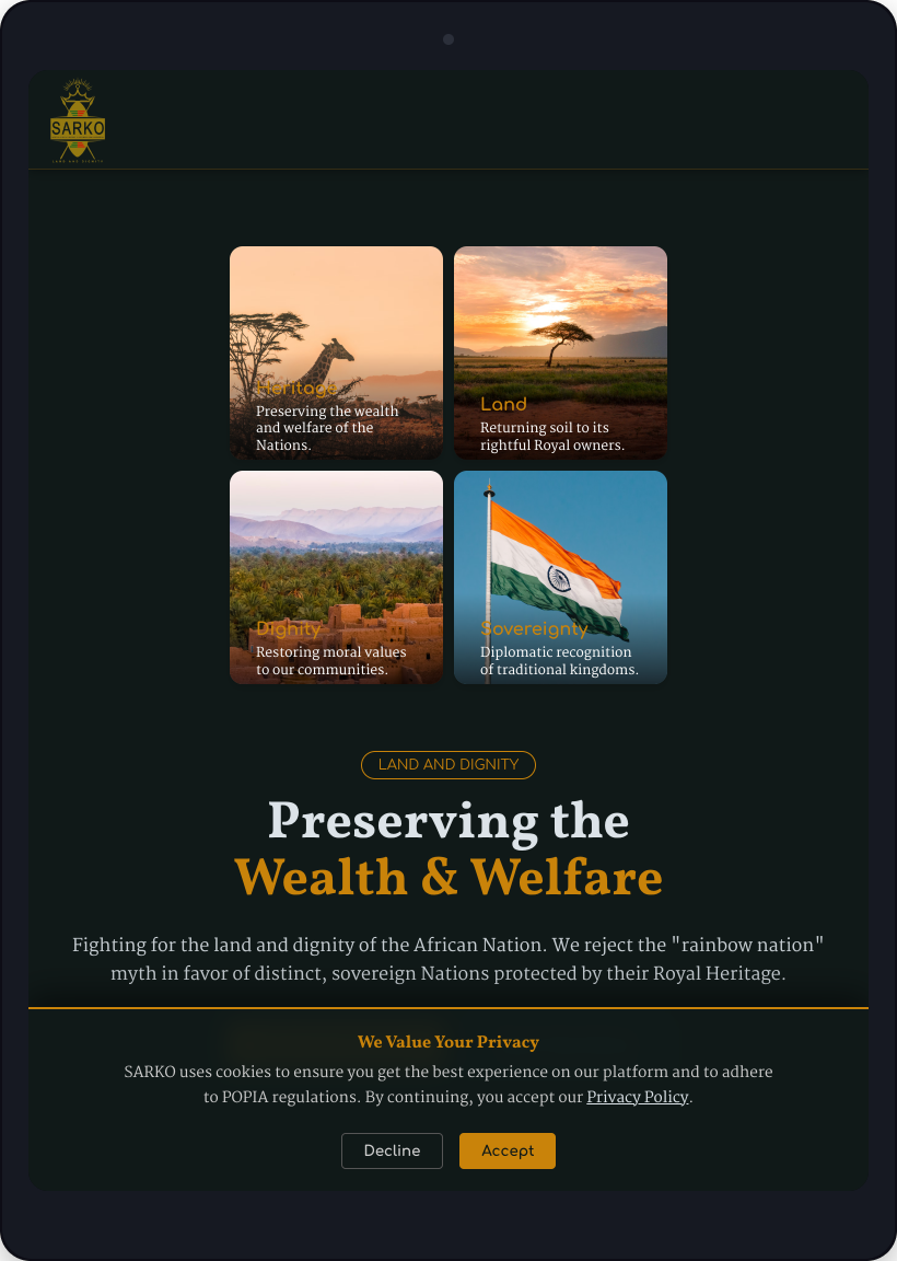
- Responsive Bento-style Values Layout
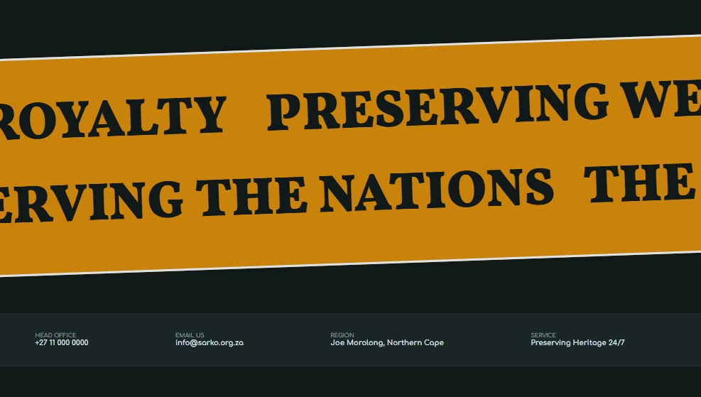
- Infinite Marquee Vote Ticker
- Exit-Intent & POPIA Cookie Modals
In Motion Motion
Responsive Design Devices
A seamless experience across desktop, tablet, and mobile devices.


Gallery Visuals


Technical Challenges Core
Creating an intricate, expanding 4-card grid in the hero section that animates seamlessly on desktop but gracefully degrades to a static grid on mobile touch devices.
Leveraged CSS absolute positioning with deliberate cubic-bezier transitions on desktop, combined with translateZ(0) for GPU acceleration. Media queries strip absolute positioning on mobile in favor of a standard CSS Grid.
Managing multiple complex modals (Membership, Cookie Banner, Exit-Intent) without state management libraries like React.
Implemented a modular Vanilla JavaScript event listener system, using shared generic classes to centralize 'close' behaviors while isolating specific trigger logic.
Key Takeaways
- Engineered an interactive, expanding CSS Grid hero section utilizing translateZ(0) to force hardware acceleration and eliminate transition flicker.
- Developed a lightweight, multi-step induction wizard in Vanilla JavaScript complete with HTML5 form validation and dynamic DOM manipulation.
- Implemented an exit-intent detection system using mouseout event listeners tied to viewport coordinates to capture abandoning visitors.
Project Outcomes Impact
- Delivered a robust, highly interactive platform that perfectly aligns with the 'Regal Guardian' brand identity.
- Created a seamless, multi-step digital membership application process, eliminating the friction of physical paperwork.